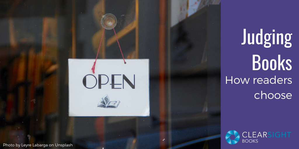
I can be a little judgy sometimes… Literally. I judge things. Essay contests. Grant applications. Poetry submissions. I recently judged twenty self-published books for a national writing magazine’s contest. While I’d hoped to judge nonfiction so I could share with you what I was seeing in the indie nonfiction space, I ended up judging children’s picture books (which I love, so yay!).
My job was to review the books and choose one to advance to the next round of judging. Since I don’t have children, after making my initial assessment, I enlisted a couple of neighbor kids and their teacher-mom to offer opinions.
Despite the different genre, I had several lessons reinforced for me about how readers choose books—including business and thought leadership books.
Lesson 1: The book cover is key
Humans—and especially children—do judge a book by its cover, so this is where I started. Did the cover look professional, or amateur? Did it feel contemporary, or dated? Was the cover copy compelling? In a nutshell, would I want to pick this book up?
My experts immediately gravitated to certain books based solely on the cover. For kids, you can get away with a solid, professional cover if it’s a “lesson” book that a teacher will pick up to read aloud to the class. But if you want the kids themselves to read it, the cover art and design must go beyond “professional” to “appealing.”
As teacher-mom said, “If they don’t open the book, it doesn’t matter what’s inside.”
Lesson 2: A book’s interior design can inspire trust—or damage it
It’s no surprise that illustrations are a critical part of children’s books. While there is some subjectivity in whether an illustration is “good,” it is possible to assess how professional the art is, how consistent the style is, how well it complements the story, and whether it feels contemporary or dated (I had a few flashbacks to the 1980s).
Likewise, with the layout you can assess the composition of the pages, the balance of text and illustrations, and the cohesiveness of the overall look and feel. The text is an important element of design, and font selection has a huge influence. If text is not designed well and styles are not applied consistently, the cohesiveness suffers.
When my kid experts looked at the interiors, they flipped through the books, skimmed the text, and pointed out the ones they liked the best. Again, the appeal of visual elements and art was key to their “liking.”
Teacher-mom was able to offer a more critical assessment. If the book did not look and feel cohesive and professional, she felt it simply wasn’t credible. In assessing one fairly well-designed book she said, “I could almost trust the content on this one.”
Lesson 3: Poor punctuation and grammar can knock you out of the running
Any book that had mechanical problems—grammar, punctuation, usage—was almost automatically knocked out of the running for the next round of judging.
By far the biggest problem I saw was punctuation: too many commas, not enough commas, hyphens and en dashes and em dashes mixed up, and too many exclamation points! But there were any number of miscellaneous grammar, diction, and clarity issues as well.
In a long technical document that has a limited audience, an occasional mistake is fine, as long as the intent is clear. However, in a book with few words and in which the text is part of the overall design, mechanical mistakes detract greatly.
My young experts weren’t quite in tune with the finer points of grammar and punctuation, but teacher-mom was—and guess who buys the books.
Lesson 4: Book content is important but…
If you’ve known me for any length of time, you know how much I value quality content—a lot. So you might be wondering if my prior criteria were too superficial. Content did indeed matter.
For these books, I asked: Did the story have a beginning-middle-end, a conflict, and some sort of character growth? Did the plot hang together logically? Was the pacing okay? How was the language? It didn’t have to be fancy, but it needed to be clear.
As picky as I am about content, teacher-mom was even more so. She assessed the underlying message for each story: Was it healthy, appropriate, and realistic?
But if a strong message was marred by poor quality design and mechanics, it didn’t advance.
How do your readers choose books?
There was no perfect book in the twenty I read. Five rose to the top, all with good-to-stunning design, but all with flaws in mechanics, messaging, structure, or that ineffable “appeal.” In the end I forwarded a book with great illustrations and design, perfect mechanics, and a good message—but which still needed work on story structure.
Your book does not need to be perfect to advance your business. But you do need understand how readers choose books and why you want them to read your book. What’s your endgame? And what impression do you want to leave?
Make sure you’ve got the “superficial” stuff in place so your readers can pay attention to your strong content and engaging voice. Your potential readers and clients are as judgy as I am—and you probably have something more substantial at stake than a contest entry fee.
Need a little judginess to know what else your book needs? A manuscript critique and strategy intensive may help. Get in touch at karin@clearsightbooks.com or 919.609.2817.