
© Can Stock Photo / iqoncept
In my last post, I discussed emphasis—the use of bold, italic, underline, ALL CAPS, and so on—primarily looking at the main text of a book or article. I mentioned headings briefly, and in this post I want to expand on the effective formatting of headings.
When I say “headings,” I’m referring to the types of titles and subtitles you find for sections of an article, report, or book chapter. My goal is not to give you hard and fast rules, but rather to help you consider the strategic use of headings to enhance your message for your readers.
The Purpose of Headings
I see headings as having two main purposes: 1) guiding the reader, and 2) offering the reader visual rest.
Headings Guide the Reader
The core purpose of headings is to act as signposts that guide the reader through the text. In addition to knowing what your message is, readers want to know their location in the message.
Headings show readers where they are in the text’s organizational structure, at what level of detail they are, and how far through the message they are. The language and formatting of headings must aid in that purpose.
Headings Create Visual Rest
A secondary, but still important, purpose of headings is to offer readers a visual break. Solid blocks of text can wear out the eyes, causing readers to lose interest. By chunking text into pieces, with titles as separators, it becomes more manageable and helps keep the reader engaged. (Other formatting that creates visual rest includes short paragraphs, white space, and bullets.)
TIP: Yoast is a plugin for WordPress. When you write a blog post, Yoast flags ways to improve the SEO (key words, links, images, tags, etc.). It also suggests ways to improve readability. If a section of text is greater than 300 words, Yoast will prompt you to break the text into smaller chunks by adding another heading. (Of course, only do this if it is appropriate for the content.)
Formatting Headings
When formatting your headings, the emphasis elements (bold, font, font size, etc.) should reinforce the hierarchy. Consistent formatting is key to effectiveness.
Styles of Formatting
There are many forms of emphasis that can be used in headings, including the following:
- Different fonts. A common approach is to put the text in a serif font and the headings in a sans serif. This article is a good example, using Georgia (serif) in the text, Montserrat (sans serif) as the title, and Oswald (sans serif) in the headings.
- Bigger fonts. The bigger the font, the higher in the hierarchy.
- Small caps or all caps. Small caps and all caps can be a good alternative to bigger and different fonts.
- Bold. Even if using a larger, different font, bold can add some “inkiness” to help headings stand out from the main text.
- Italics. Italics on their own may not work so well as a heading, but they can work in conjunction with font size or bold.
- Underlining. As in text formatting, underlining is less common in headings, but can work in the right situation.
- Color. Online and in textbooks, color is often used (in conjunction with fonts and size) to distinguish headings from text. Standard paperback or hardback books typically stick with black and white.
- Centering. Since the main text of a book or article is typically left justified or full justified, centering headings sets them off effectively.
You may use these different forms of emphasis alone, or in combination.
Hierarchy of Headings
Headings help readers know where they are in the organizational structure of the document or book. You probably recognize hierarchy in formatting even if you don’t realize it. The formatting of chapter titles, headings, and subheadings lets you know intuitively which is higher up in the hierarchy.
For example, in this article:
- The title is clear at the top of the page in a big, bold, round font (Montserrat): “Tips for Formatting Headings.”
- The first level of hierarchy is in a bold, narrow font (Oswald)—big but not as big as the title. It includes “The Purpose of Headings,” “Formatting Headings,” and “Scannability of Headings.”
- The second level is in the same bold, narrow font but smaller than the first level headings. It includes “Styles of Formatting, “Hierarchy of Headings,” and “Consistency in Headings.”
For most articles, blog posts, and other short pieces, I’d suggest using no more than two or maybe three levels of headings (in addition to the title of the piece). The complexity of most short pieces does not warrant more than three levels of hierarchy.
For a book, you might need three to four levels of headings; I generally target three in most of the nonfiction books I work on.
Consistency in Headings
However you decide to format your headings, they need to be formatted with consistency to give readers a clear roadmap.
When using programs like Microsoft Word or WordPress, you can easily create consistency in your headings by using the Style function. Each program comes with several levels of headings already defined (Heading 1, Heading 2, Heading 3, etc.). Simply select the heading text in your document, and then choose the appropriate heading from the Styles box.
BONUS 1: When you use defined styles, you can change the definition of those styles at any point. Any text that already has that style assigned to it will be updated automatically—even in a book-length document. (Think of the time that can save you!)
BONUS 2: When working online, using the heading styles can improve your SEO. When you apply a style to text, H1 and H2 tags are applied. Those tags indicate to search engines that those words are “important,” thus making them easier to find in searches.
Heading Formatting Example 1: My Print Documents
Here is an example of how I format my print documents.
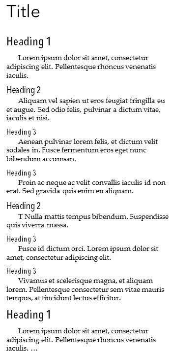 I use Avenir Next Regular 26 point font as the title.
The headings are all Avenir Medium Condensed, with Heading 1 in 18-point, Heading 2 in 14-point, and Heading 3 in 12-point.
My main text is 11-point Palatino Linotype.
Notice I do not use bold in my headings; I find the difference between the heading font and the main font shows well enough.
Font size is the key differentiator in the hierarchy. I also tend to leave headings left justified.
Heading Formatting Example 2: A Client’s Book Chapters
This client’s book is a good example of using the same font for everything, in this case Palatino Linotype.
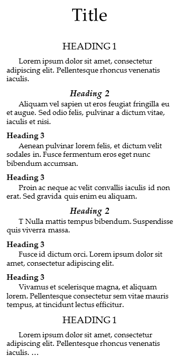 The chapter headings were title case, 26-point, centered.
Heading 1 was all caps, bold, 14-point, centered.
Heading 2 was title case, bold, italic, 13-point, centered.
Heading 3 in bold, 12-point, left justified; this heading was used much less frequently than the others.
The main text was 11-point.
Font size is a primary differentiator in the hierarchy, but the forms of emphasis used also contributed. Remember ALL CAP is generally more emphatic (higher in the hierarchy) than bold, and bold is more emphatic than italics. Centered is more emphatic than left-justified.
If you look at any two headings, you should be able to easily determine which is higher in the hierarchy.
Scannability of Headings
Since headings act as signposts, they must make sense on their own. Readers need to be able to scan them to see where they are and what to expect next.
I find examples the easiest way to explain headings that are scannable versus those that are not.
Scannability Example 1: Blog Post
When you read the following headings, do you know what to expect from this article?
- Leaders, pay attention
- Execution is everything
- Start at 1
- Step it up
- How does it work?
- Beyond the COO
- Now is your chance
Um, something about leadership and execution, but I’m not exactly sure what.
Unfortunately, this is the type of thing I see all too often. These headings add very little value and are not useful to the reader. (In addition, these headings are in bold and the author also used liberal amounts of bold in each paragraph, making it even more confusing to figure out what was important.)
Scannability Example 2: Book Chapter
On the other hand, look at a chapter from Becky Sansbury’s book, After The Shock: Getting You Back On The Road To Resilience When Crisis Hits You Head On. The chapter is titled “Comfort: Freedom from Pain and Constraint.” If you scan the headings, you see:
- What Do We Mean by Comfort?
- The Value of Comfort
- Talking Around Comfort
- Comfort Is Personal
- Physical Pain vs. Emotional Pain
- Finding Comfort for Yourself
- Rituals
- Traditions
- Finding a Catalyst for Comfort
- Helping Someone Else Find Comfort
- Naming the Pain
- Careful Listening
- Working with Family
- Working with Professional Personnel
- Highlight Story: Don’t Move or You Could Die
- Comfort Summary
Do you have a clear idea what the chapter will contain? Yes. Many of the headings are complete thoughts or phrases, and the second-level headings clearly relate to the first-level headings.
Additionally, readers who want to reference a particular concept later have a much better chance of finding it by scanning the headings. Could you have done that with the first example? My guess is not.
Example 1 is not very scannable; Example 2 is.
Redundancy in Headings
Many people read headings as though they are part of the text. In other words, they read all the words in one flow. However, some people (myself included) completely skip over the headings during the reading process (even though they may scan headings to locate information later). As a result, any information contained in the heading also should be in the text.
To put it another way, readers should be able to read the text without reading the headings and not lose any meaning.
For example, in the book After the Shock noted above:
- The section titled “What do we mean by Comfort?” starts with “Merriam-Webster defines comfort as…[definition].”
- “The Value of Comfort” section begins “Why is comfort important?”
- “Comfort Is Personal” starts “While food may be a universal example of a way to experience comfort, each individual has her own preferences.”
Each section offers a signpost (a clear heading) for those who use them, but also provides complete context without reading the headings.
Are you using headings effectively?
The power of effective headings is often overlooked. Careful writing and formatting of your headings helps lead your readers through your message logically and allows them to locate specific points easily. The combination of effective headings and purposeful use of emphasis in the text enhances the reading experience.
If your readers finish, understand, and embrace your message, how might that affect them? And you? And your business?