Earlier this month I attended the Kennedy Center’s Leadership Exchange in Arts and Disability (LEAD) Conference, an event designed to build the capacity of arts and cultural organizations to fully engage people with disabilities. I was drinking from the proverbial firehose on the topic of accessibility, but it got me thinking specifically about accessibility in books.
Accessibility is defined as the ability to use a product, service, or place regardless of disability. One of the frameworks for thinking about disability (a new one to me) is that we are all more or less disabled depending on the environment. This means we can design the environment to be less disabling.
Some readers with limited vision read print books, especially large-print editions. And for many people who are blind or have low vision—or, as the Accessible Books Consortium puts it, people who are “print impaired”—an e-book solves many challenges. So let’s consider how we can keep these reading environments as accessible as possible.
While a large-print edition is an excellent option for readers with limited vision, many of the tips here apply to both large-print and standard editions.
Font
Choose an easily readable font for the main body text. Most books are printed in a serif typeface (serifs are those little flourishes at the end of a character’s stroke—think Georgia or Palatino), because serifs are believed to draw the eye along and make it easier to read.
For large-print books, however, the American Printing House for the Blind (APH), recommends a sans serif font, like Tahoma or Helvetica.
There is some debate on serif vs. sans serif, but regardless, some fonts are simply more readable than others. For example, thin fonts are harder to read because they provide less contrast with the background.
For blocks of text, avoid use of italics, bold, or all caps, as they are simply too difficult to read. Use them only for emphasis—think short phrases or headings.
Font size
Standard books have body text in the 10- to 12-point range. Large-print books use at least a 14‑point font, but APH defines large print as using at least an 18‑point font. The needed size can vary depending on the font itself.
White space
To ease reading, increase the amount of white space on the page. For example, use larger leading (the space between lines), more spacing around headings, or larger margins.
Also, remove unnecessary graphics, especially in large-print books. This doesn’t mean cutting critical diagrams or illustrations, but it might mean cutting decorative images that can act as visual clutter for some readers.
Color
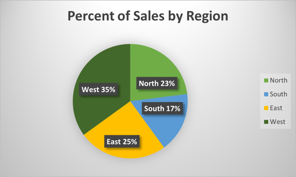
If you use color, make sure there is adequate contrast between multiple colors. And don’t rely on color alone to communicate your intent. For example, if you have a pie chart, by all means use color to distinguish the slices, but also label each slice for those who can’t distinguish the colors in order to decipher the legend.
Figure 1 below demonstrates with a pie chart for sales in four regions, using dark green, light green, blue, and yellow. Notice that the light green and blue are fairly close in tone. However, the pie chart slices are also labeled (“East 25%,” “West 35%,” and so on), so that even if the color is unclear, the label provides the critical information for the reader. Notice also that the information is provided in white text in a black box, so that it is easily readable. Without the box, black text would be lost on the dark green, and white text would be lost on the yellow.
Ebook
Many of the guidelines for print also apply to ebooks, but there are some differences and additional recommendations as well. Remember that people could be reading your book on their device or they could be listening to it with text-to-speech (TTS) functionality or a screen reader.
Font
Ebooks like those used on Kindle, Kobo, or Nook are designed to have reflowable text with changeable fonts, type sizes, and background color (for example, white text on a black background instead of black on white). When creating an ebook, ensure that that functionality remains available to readers so they can customize their reading experience.
It’s okay to use more stylized fonts on headings, but leave the main body text standard and changeable. (That is, don’t force a font override in the HTML.) According to KDP’s help file: “Unless embedded fonts are necessary to convey intent, Amazon recommends using the default set of fonts installed on Kindle devices and applications because they have been tuned for high quality rendering.” My Kindle app has Baskerville, Bookerly, Caecilia, Georgia, Helvetica, Lucida, and Palatino; a recent addition appears to be OpenDyslexic, a font designed to help people with dyslexia (reviews are mixed).
Additionally, be sure the text is not set to have a background color (even if it’s white). If the user changes the background color on the device, it may display incorrectly or in odd blocks.
Text-to-speech
Text-to-speech (TTS) technology enables an ebook to be read aloud by a synthetic voice. Some Kindles have this function built in. Microsoft tools like Word have a Read Aloud function built in. And for a variety of documents, people with limited vision may use screen readers.
When setting up your ebook, if the TTS setting is available to you, be sure to enable it.
Related, if you enable digital rights management (DRM), it could cause problems with TTS functionality. While DRM was originally designed to protect intellectual property by making it difficult to copy the file, it can also cause problems for legitimate uses, including TTS. I typically recommend leaving DRM disabled.
Maybe my favorite tip: Write as though your book will be listened to.
Images
Use high-resolution images so readers can zoom in without the image getting pixelated.
Use alt text, short for alternative text, which is metadata attached to an image that a screen reader will read. If an image is purely decorative, mark it as decorative so the screen reader knows to skip it. There’s a lot of great advice online about how to write alt text, so I won’t repeat it here, but I did find this Microsoft article pretty useful.
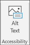
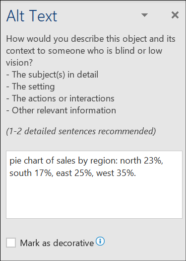
The button for alt text in Microsoft Office is shown in Figure 2, and the field for entering alt text or marking an image decorative is shown in Figure 3.
Don’t put large chunks of text in images. A small amount of text can be included in the alt text, but if the image is primarily text, you’re usually better off leaving it as text so that screen readers can read it.
Use clear labels on figures and refer to the figure number in the text: “In Figure 2, we see a diagram of…” And use consistent language across figures and text; for example, the steps in a process or the parts of a diagram should use the same terminology in both the image and the text.
Imagine you are listening to the text describing an image: would you be able to follow the point being made without seeing the image? Clear description in the text benefits anyone with vision loss as well as anyone who is listening to an audiobook.
Tables
Tables are great for summarizing information or providing additional information. As a general practice though, any critical content should be covered in the text as well as in the figure. This benefits vision-impaired readers but also benefits people with different learning and reading styles.
Structure tables properly, with clearly labeled columns and rows, so that screen readers can read them. (BTW clear labels are just plain old good design.) As with large blocks of text, avoid placing tables in images.
Structure
Ebooks are created in some form of HTML (HTML, XML, CSS—or some combo—don’t ask me for detail LOL). For readers to navigate, the ebook’s structure must be properly defined using heading tags: <H1>, <H2>, and so on.
One way of creating a Kindle ebook is to convert a Word document into an HTML file. I love using Word’s Style function for assessing structure in documents. This habit becomes super handy for generating the proper HTML tags in an ebook. When you save a Word document as HTML, Heading1 becomes <H1>, Heading2 becomes <H2>, and so on.
Test, Test, Test
Always test your ebook file before publishing. KDP has an online viewer and a downloadable one. Make the types of changes a user might make—font, font size, color, zooming in on images—to ensure the ebook displays as intended.
Accessibility benefits everyone
As you read these tips, did you notice that they might benefit not only someone who is blind or has limited vision but also someone who wears “cheaters” (reading glasses) or whose eyes are tired from working on the computer all day?
This is a common pattern with accessibility in any environment, books or otherwise: when incorporating tools for a particular disability into our design, we achieve better usability for everyone.
Resources for book accessibility
I’m far from being an expert on accessibility in books, and this article only scratches the surface (we didn’t even discuss Braille or audiobooks!), so let me give you a few more resources:
KDP’s text guidelines for reflowable text Kindle eBooks
The Accessible Books Consortium’s Best Practice Guidelines for Publishers
APH’s Guidelines for the Development of Documents in Large Print
We do our best at Clear Sight Books to be accessible and inclusive, but we know we’re still learning. Don’t hesitate to get in touch to share more tips with us. Just email karin@clearsightbook.com.