
In “How to Publish an Ebook: Essentials for Authors,” we provide an overview of ebooks for indie authors. In this companion article, we look at tactical details and offer some practical tips. As with the first article, we’ll focus primarily on reflowable ebooks rather than fixed-format ebooks. And please be sure to read the first article—I will try to avoid repeating too much info here, so if you don’t follow something, it may have been covered in the other article.
Ebook Formatting Philosophy
Right off the bat, it’s important to understand that your ebook will never look exactly the same as your print book. Think of the number of devices and platforms readers might use: phone, Kindle, tablet, computer.
Perhaps more importantly, think of the elements they can change about how the book is displayed in their e-reader:
- Font – Readers can choose the typeface.
- Font size – Readers can choose the type size (thank goodness for some of us…)
- Line height – Readers can put more/less space between the lines.
- Text color and background color – While the default is usually black text on a white background, depending on the device, readers can often change to white on black (dark mode), sepia text on a taupe background, and probably other color combos.
- Portrait versus landscape orientation – Readers can look at the book tall or wide.
I’m sure there are other elements readers can change that I’m unaware of, but the point is that all these things affect the “page” layout. And since you don’t know what elements readers will change, you don’t know exactly how their pages will appear.
So, the goal in formatting an ebook is to make it look good and make it easy to read on as many devices with as many settings as possible. This means that ebook formatting is often more simplified than print formatting.
General Ebook Formatting Guidance
My starting place for an ebook is usually a Word document. If you format it properly, you can then upload it directly to KDP or to one of the EPUB creators (aka converters) listed in the first article. You’ll need to test it and almost certainly make adjustments, but the conversion is often fairly straightforward and the resulting file relatively clean.
The first article provides the general process I use for creating an ebook. Here I will give you some detailed notes about how I format ebook files, but it is likely that at least some of these tips will not apply to your book. And if you build your book directly in an ebook creation tool, you may be able to skip a lot of this. It all depends on the complexity of your book and your chosen tool(s).
Additionally, KDP has an excellent resource for formatting your ebook: Ebook Manuscript Formatting Guide.
Page numbering
With reflowable ebooks the concept of pages becomes more fluid. While some e-readers give the impression of pages and let you “turn” the page, the page numbers from your print book become obsolete when the reader changes their e-reader’s settings.
So one of the first things I do is strip out the headers and footers from the Word document. This is where the page numbers are usually found. You may also have the book title, author name, and/or chapter title repeating in the header. These all go away.
Chapters and table of contents
A table of contents is a must-have for an ebook. If you’ve set up your styles correctly in Word and are using the Heading 1, Heading 2, and Heading 3 styles, you will be in good shape for the table of contents. The chapter title is typically set as Heading 1.
For more info, see this article on the automatic table of contents and this article on styles.
Additionally, you may need to add a manual page break at the end of each chapter. (Do not just press Return over and over until you reach a new page—remember, the pages in Word are meaningless in an ebook.)
Fonts
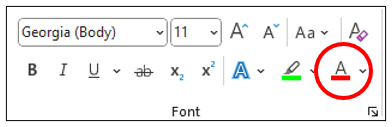
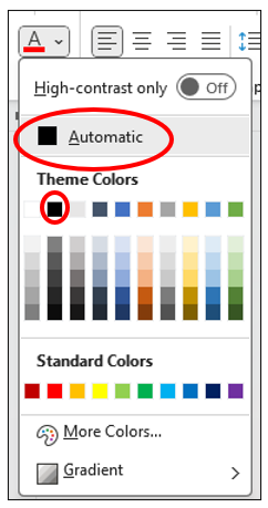
Because the reader can change the fonts in their ebook reader, the best practice is not to embed fonts or force the reader to use your preferred fonts. Let them use the font that is easiest for them to read. So first change all the fonts to one basic default font—something that is included in Word, such as Georgia or Palatino Linotype.
(If you really want some style, you could embed the Heading 1 font to set off your chapter headings.)
Additionally, change all the font colors to Automatic (rather than black). This allows the reader to go to, for example, dark mode and not wind up with black text on a black background.
Special characters
When I format ebooks that started as print books in Word or InDesign, the starting document often has special characters that were used to assist in print formatting. But those characters can cause problems or render incorrectly in an ebook.
Here are a few characters I look for and remove if they are not needed:
- Manual line breaks – For instance, we sometimes use a manual line break to get a chapter title to break after a certain word.
- Optional hyphens – These are typically used at line ends to balance the spacing between words.
- Nonbreaking spaces – Sometimes in formatting I want to keep a couple of words together so a line doesn’t break weirdly, but that is not an issue in an ebook. In fact, ebook readers typically hyphenate whether you want them to or not. Do keep the nonbreaking spaces you need though—for instance, in ellipses . . . so the periods stay together.
Images
When using images in your ebook, make sure they are adequately high resolution. If readers pinch and zoom, the image needs to be readable. However, you don’t want excessively high resolution or your ebook file size can get cumbersome (and cost you more in delivery fees on some platforms).
Typically JPGs or PNGs work well. When in dark mode, JPGs often have a white background, so you may prefer PNGs with a transparent background. Watch for this in testing.
Finally, be sure to add alt-text to all images, or to mark them as decorative (i.e., images that don’t add information to the content).
Tables
Tables can be tricky in ebooks. Imagine your ebook has a large, complex table of numbers and your reader tries to increase the font size to read it on her phone. What will happen?
Bleh. That’s something to be sure you test.
However, I have found that simple tables work fairly well—and I do mean an actual table, not a JPG or PNG image of a table.
A couple of tips:
- Add borders to all cells. This makes it easier to see the correct spacing if the lines wrap on a reader’s device.
- Use consistent alignment in a column. For instance, put numbers flush right so they align properly. Put text flush left. You can center the contents, but that sometimes becomes more difficult to read (IMO).
Again, test any tables before publishing your ebook.
Endorsements
Some authors include endorsements (“blurbs,” often labeled “Praise for Book Title”) at the very beginning of their book, even before the title page. However, if readers want to get a preview of your ebook before buying, the sales site (such as Amazon) often shows the beginning of the book. If readers see the endorsements, they don’t get a very good feel for the book itself.
Move the “Praise” section to the end of the book—for example, after “About the Author.”
Footnotes/endnotes
I have found that ebooks are kind of cool when it comes to endnotes/footnotes. If they are set up properly, a reader sees the superscript number in the text, and it is a hyperlink they can click on; the note pops up for them to read and then they close it. Or, on some devices, they might get linked to the list of notes and then can jump back to the note location in the text.
However, it’s worth noting that EPUBs don’t really distinguish between footnotes and endnotes. They seem to get treated the same. So if you have both in your book, you might need to convert them all to one or the other in order for the numbering to work properly. (I’m not 100% sure—you’d have to test it to see if you can use both together.)
Index
There are two types of indexes: a back-of-book index and an embedded index. If you want a functional index in your ebook, you need an embedded index. I have worked with embedded indexes all of two times, so my experience is limited and it entailed a lot of trial and error. But I’ll give you my advice to date…
In both cases, I started with a Word document in which a professional indexer had created and linked the embedded index. And in both cases, I did the normal formatting clean-up as described above.
In one case, I was publishing to KDP only, and I was able to use the Word document, which KDP converted correctly. The index showed page numbers, which of course are nonsensical in a reflowable ebook; nonetheless, they worked correctly and gave a sense of where the term was found in the book.
In the second case, I was publishing “wide” (more than just Amazon) and needed an EPUB. This entailed significantly more effort to find a method that worked. I’ll give the high-level steps, but I suggest you tackle this only if you are comfortable working with a little bit of HTML.
- I opened the Word doc in Calibre and converted it to EPUB. Calibre maintained the index links properly, but the formatting of the index was a little funky.*
- Then I used Calibre to edit the index in the EPUB (in HTML). Some things had to be corrected:
- Every index entry ends up on its own line instead of in a single line like in the back-of-book index, but all the commas were still there, so I had to remove the excess commas.
- Any entries that started with “The” had to be realphabetized from “T” to the correct letter.
- When there were multiple entries of a term, some groupings appeared in reverse order (listing the last location first), so I had to manually move them around.
- I saved the EPUB and ran it through the EPUB validator on D2D. It provides a report that tells you if one of the HTML files has a problem, and very nicely it tells you what line the problem is in. I had just a couple of copy/paste issues to correct in the index, and then I was good to go.
- Throughout this process and before I finalized anything, I tested the EPUB in the Kindle Previewer.
- Once I was satisfied, I saved the EPUB out of Calibre for upload to KDP, D2D, and elsewhere.
* I also tested the Draft2Digital (D2D) and Reedsy Word-to-EPUB converters. The D2D converter worked for the index but the book also had endnotes, and D2D lost the two-way endnote links (so they didn’t pop up). The Reedsy converter kept the endnotes but lost the links in the index.
Ebook Testing
Whenever I’m working on an ebook, I test it regularly to see if it works properly, adjust if needed, and retest. I should note that I am typically working on nonfiction books, and they often have some complexity with images, tables, endnotes, and/or indexes.
If you are creating a straightforward ebook with basically text (e.g., a novel), and if you are using one of the online creators/converters, you may not need as much testing as I do.
Ebook testing tools
These are the tools I use most regularly when working on an ebook:
Kindle Previewer (desktop) – This is a super friendly tool that lets you open a Word document, EPUB, or several other ebook file formats. You can:
- Change all the things a reader might, such as font, font size, and color.
- Preview by device types and orientation (both portrait and landscape).
- View all the pages or just the image pages.
- Run the quality checker, which will catch any broken URLs.
- Jump around in the table of contents.
- Test your index and footnote links.
Kindle Previewer (online) – When you are almost ready to publish your ebook on KDP, upload your file and test it in the online previewer. The functionality is more limited than the desktop version, but it runs a couple of other checks that the desktop version does not (like spellcheck).
Calibre – Calibre is a little more technical than the Kindle Previewer, but if you want to see how your book renders on other devices, it might show you things that the Kindle Previewer does not. For instance, I suspect that the Kindle Previewer automatically resolves some common issues related to fonts during the conversion process, but Calibre does not. Viewing your file in Calibre may help identify potential problems if you are publishing outside KDP.
Calibre also lets you edit files in HTML and can convert your book to a number of different formats. If you are editing, be sure to run the error checker that is built in. It might not identify all problems, but it will catch some.
D2D EPUB Validator – If you are creating an EPUB and are not using one of the online converters (D2D, Reedsy, etc.), it’s a good idea to validate that the final EPUB works properly. If you upload to an aggregator an EPUB file that does not pass the validation, they may not accept the file, or they may accept it but warn you that retailers may not accept it.
The D2D validator checks for the EPUB2 standard (I don’t know whether it can check for the EPUB3 standard). If there is an error, it will tell you the file and line. Of course, this presupposes that you know how to edit the file . . .
Things to watch for in ebook testing
When you test, you are mostly looking for formatting that is not rendering as intended. If you are using Kindle Previewer or Calibre, try changing various settings, and watch for:
- Fonts looking weird or not showing as you expected
- Indents being too big
- Bulleted lists not displaying correctly
- Unexpected characters (such as optional hyphens, which look like a sideways capital L)
- Images/graphics not visible, not expandable, or showing strangely when in dark mode
- A missing table of contents
If something looks odd, go back to the original file, adjust it, and test it again.
Regular Updates to Your Ebook
One of the benefits of ebooks (and print-on-demand publishing as well) is that file updates can be made essentially at any time. If you find a typo, a broken link, or have an updated piece of information, you can change the EPUB (or Word doc) and upload the fresh file. From that point forward, purchasers will receive the new file.
However, existing readers may or may not receive the update. KDP, for instance, typically does not push out ebook updates unless they are critical (and in that case the author must contact them for help). It is my understanding that some ebook platforms do push out updates or at least give the reader the option to receive them.
For readers who already have the ebook though, updates introduce a potential problem: if they have been making notes in the ebook, those would get lost when a new ebook file is delivered.
Nutshell: Try to get your ebook content right the first time. Make updates if really needed, but don’t try to force them out to readers.
Give It a Try
I know this article has a lot of information, and it might be confusing to sort through the things that apply to you. If you are less technical, you might prefer using one of the ebook creation tools (whether free or paid). By working directly in those tools, the coding is handled for you and the technical know-how you need is reduced.
But I want to encourage you to not be intimidated by the process. Give making an ebook a shot. If it doesn’t work, you don’t have to press the Publish button until it does!